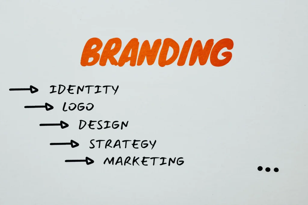
A logo is often the first visual element people notice about a business. Before customers read a company’s story, compare its services, or explore its website, they may already have formed an impression based on its logo.
That is why logo design service should be treated as more than decoration. A well-designed logo helps communicate what a business represents, creates visual consistency, and makes the brand easier to recognize across websites, social media, packaging, advertising, and other marketing materials.
For businesses that want a carefully developed visual identity, working with a professional logo design service can help turn a basic idea into a distinctive brand mark that works across different applications.
What Makes a Logo Important for a Business?
A business can have excellent products or services, but customers still need a simple way to recognize and remember it.
A logo performs this role by acting as a visual identifier.
Think about the different places where a company appears. Its identity may be shown on a website header, social profile, invoice, business card, advertisement, storefront, product label, or mobile screen. A recognizable logo connects all these different touchpoints.
Instead of presenting the business differently every time, the logo provides a consistent visual reference.
Consistency becomes particularly important as a company grows. Customers who repeatedly see the same brand elements are more likely to associate those elements with the business.
A Good Logo Starts With a Clear Idea
Strong logos usually begin with a clear concept rather than complicated decoration.
Before designing anything, it is useful to understand several basic questions:
What does the company offer?
Who is the intended audience?
What personality should the brand communicate?
Where will the logo be used?
What makes the business different from competitors?
The answers influence almost every design decision.
For example, a technology company may benefit from a clean geometric identity, while a children’s brand might need something friendlier and more expressive. A luxury business may prefer restrained typography and simple forms rather than a highly detailed illustration.
The visual direction should support the character of the business instead of following a style simply because it is currently popular.
Simplicity Improves Recognition
Some business owners assume that adding more elements makes a logo more impressive.
In practice, unnecessary complexity can make a logo harder to recognize.
Simple designs are often easier to remember because people can quickly understand their main shape or idea. They also tend to perform better when used at different sizes.
A detailed logo might look attractive on a large computer monitor but become unclear when reduced to a small social media profile picture.
Professional logo design therefore involves deciding not only what should be included, but also what can be removed.
Every shape, line, letter, and symbol should have a purpose.
Typography Has a Major Role in Brand Personality
Typography is one of the most important parts of logo design, particularly for wordmarks and combination logos.
Different letterforms create different impressions.
Bold geometric fonts can feel modern and confident. Traditional serif styles may communicate heritage or professionalism. Rounded typefaces can make a brand appear more approachable.
However, choosing a font is only the beginning.
Letter spacing, proportions, weight, alignment, capitalization, and custom modifications can significantly change how professional a logo appears.
Even small spacing problems can make otherwise good typography feel unfinished.
This is why custom adjustments are often necessary when developing a polished brand identity.
Color Should Support the Brand
Color can help strengthen recognition, but it should be selected carefully.
Instead of choosing colors only because they look attractive individually, designers consider how the complete palette supports the personality of the business.
A brand might use strong contrasting colors to create energy or use softer tones to communicate calmness. Some companies rely on a single dominant color, while others use a small supporting palette.
The logo should also remain understandable without color.
Testing the design in black and white is a useful way to determine whether the underlying shape and composition are strong enough on their own.
If the design only works because of gradients, effects, or multiple colors, it may become difficult to use in certain applications.
Logo Design Should Work Across Different Sizes
Modern brands need logos that can appear almost anywhere.
A logo may be displayed as a tiny browser icon one moment and printed on a large sign the next.
This creates an important design requirement: scalability.
Fine details that look good at large sizes can disappear when the logo becomes smaller. Thin lines can become difficult to see, and complicated shapes can merge together.
Professional designers therefore test logos under realistic conditions instead of evaluating them only on a large artboard.
Businesses looking for a refined identity can explore professional logo design approaches that focus on clarity, proportion, scalability, and practical brand use rather than creating a mark that only looks attractive in one presentation.
Originality Matters More Than Following Trends
Design trends can provide inspiration, but relying too heavily on them can cause brands to look similar.
A visual style that appears modern today may also become dated quickly.
More importantly, using the same symbols, layouts, and typography as many competitors makes it harder for customers to distinguish one company from another.
A more effective approach is to understand the industry while searching for a distinctive visual idea.
Originality does not necessarily require creating something extremely complicated.
A small modification to a letter, clever use of negative space, unusual geometric construction, or meaningful combination of two ideas can create a memorable identity.
The goal is not simply to make the logo different. The difference should still make sense for the business.
Negative Space Can Create Smarter Designs
Negative space refers to the empty space around or inside design elements.
Experienced designers often use this space intentionally.
Instead of adding another symbol, they may allow an image or letter to appear naturally inside an existing shape.
This technique can make a logo feel clever without increasing visual complexity.
However, negative-space concepts should remain easy enough to understand. If viewers need a long explanation before recognizing the idea, the concept may be too complicated.
The strongest designs usually balance creativity with clarity.
Balance and Proportion Create a Professional Appearance
People may not consciously measure the spacing inside a logo, but they often notice when something feels wrong.
An icon that is too large, uneven spacing between letters, or poor alignment between a symbol and company name can make the identity appear less polished.
Visual balance involves controlling:
- Symbol size
- Letter spacing
- Line thickness
- Alignment
- Empty space
- Overall width and height
- Relationship between icon and typography
Professional refinement frequently happens through many small adjustments rather than one dramatic change.
These details help turn a rough concept into a finished identity.
Different Businesses Need Different Types of Logos
There is no single logo structure that works for every company.
Several common approaches can be used depending on the brand.
A wordmark focuses primarily on the company name. This can work well when the name itself is distinctive.
A lettermark uses initials or shortened lettering, which can be useful for businesses with long names.
A symbol or brand mark relies mainly on an icon.
A combination mark includes both typography and a symbol, giving businesses more flexibility across different applications.
An emblem places text and visual elements inside a unified shape, creating a badge-like appearance.
The best structure depends on how customers will interact with the brand and where the identity will appear most often.
A Logo Should Fit Into a Larger Visual Identity
A logo is important, but it should not be treated as the entire brand.
Businesses also need consistency in typography, colors, imagery, layout, tone, and other visual elements.
The logo becomes the foundation that helps connect these elements.
For example, colors introduced through the logo may later appear on the website, social graphics, packaging, and advertisements. Typography may influence the fonts used in headings and marketing materials.
When these elements work together, the business appears more organized and recognizable.
Common Logo Design Mistakes to Avoid
Several problems can weaken an otherwise promising logo.
Using too many colors can make the design difficult to control across different formats.
Adding unnecessary icons can make the composition crowded.
Following popular design trends too closely can cause the identity to look generic.
Choosing typography without adjusting spacing can create an unfinished appearance.
Using very thin lines can cause problems at smaller sizes.
Designing only for a website without considering print and social media can limit how useful the final logo becomes.
Avoiding these problems usually leads to a cleaner and more flexible identity.
Why Multiple Logo Versions Are Useful
A business often needs more than one layout of the same logo.
The primary version might use a horizontal arrangement containing the symbol and business name.
A compact version may place the symbol above the text.
An icon-only variation might be used for social profiles, browser icons, or applications where space is limited.
Black and white versions are also useful when color printing is unavailable or when the logo must appear over different backgrounds.
These versions should still feel like the same brand rather than completely separate designs.
Designing for Long-Term Use
A strong logo should support the business for years rather than needing replacement whenever a new visual trend appears.
This requires careful decisions during the design process.
Instead of asking whether a design looks fashionable today, businesses should consider whether it remains clear, recognizable, appropriate, and flexible.
A timeless identity does not mean avoiding creativity. It means prioritizing the core brand idea over temporary effects.
Simple geometry, thoughtful typography, balanced proportions, and meaningful concepts generally provide a stronger foundation for long-term use.
Final Thoughts
Professional logo design combines strategy and visual communication.
The strongest identities are not necessarily the most complicated. They are usually the ones that communicate a clear idea through carefully chosen shapes, typography, colors, spacing, and proportions.
A successful logo should be recognizable at different sizes, appropriate for the company, easy to reproduce, and flexible enough to support the wider brand identity.
Businesses that approach logo development with these principles can create a visual identity that feels consistent and professional wherever customers encounter the brand.